now 2.0
O V E R V I E W
Urbano Express is the country's leading domestic logistics company, with nearly 30 years of experience and nearly 1,000 employees, and has been serving the Salvadoran market providing traditional logistics services. In 2020, as e-commerce penetration started to boom in El Salvador, Urbano took an aggressive approach to become the premiere e-commerce logistic facilitator by launching its own app, Urbano NOW. The app is a marketplace where your can choose from hundreds of restaurants and retail stores.
R O L E
Creative Lead
Visual Design, Art Direction, Prototyping, Branding, GTM strategy
D U R A T I O N
5 months
01 Understanding the problem
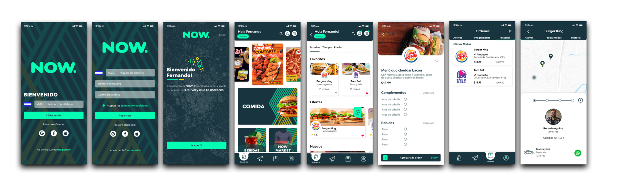
Before I joined the team at now, the team had already release a 1.0 version for the app that had been executed based on a rushed timeline to penetrate the market when the need was at its highest in the country.
I conducted research interviews with our primary users (restaurants, drivers and end-customers) to uncover any pain points that they were experiencing with the 1.0 version release and discovered the following:
Functional issues across devices. Mainly due to the fact this was built based on a single device size.
Lack of intuitive features and flow. The biggest issue here was the first release tried to encompass too much making the navigation very complicated.
Brand look and feel and overall UI felt disconnected with the modern solution being offered.
Lack of product differentiator among other apps. Most of the users said the app was “okay,” but it didn’t have anything special for them to switch from their current food delivery app.
N O W 1.0
02 Re-skinning the solution
D E S I G N A P P R O A C H
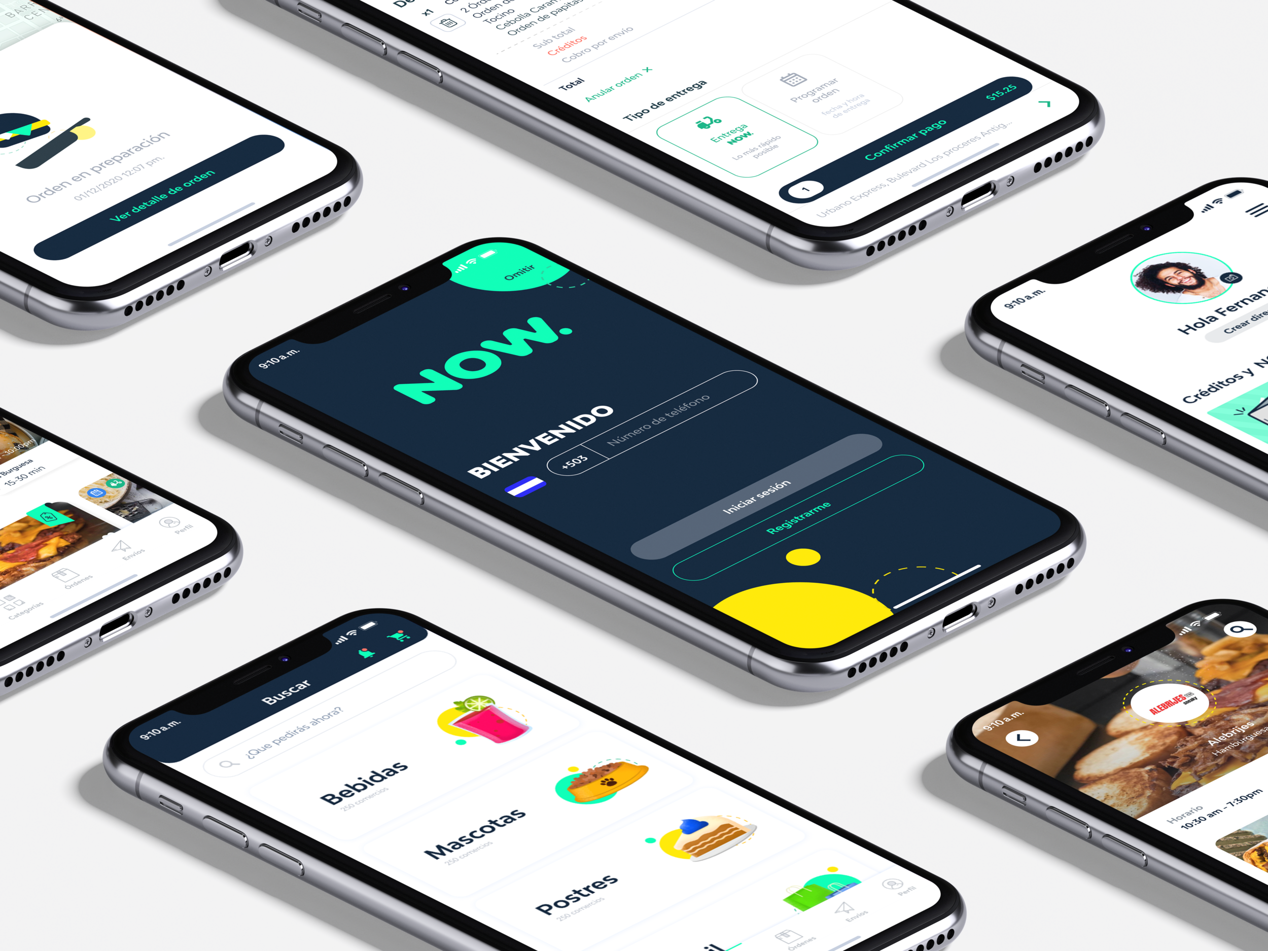
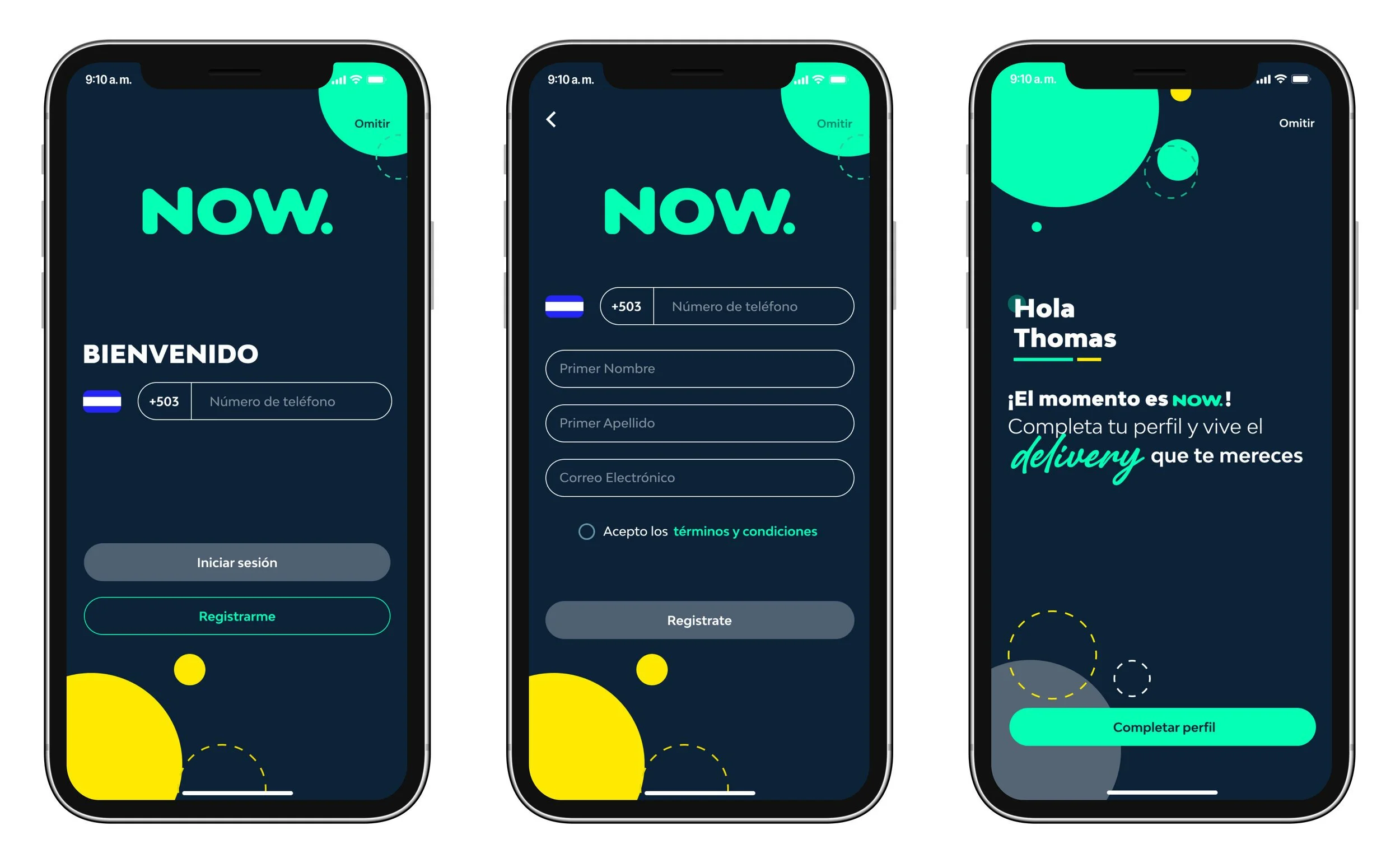
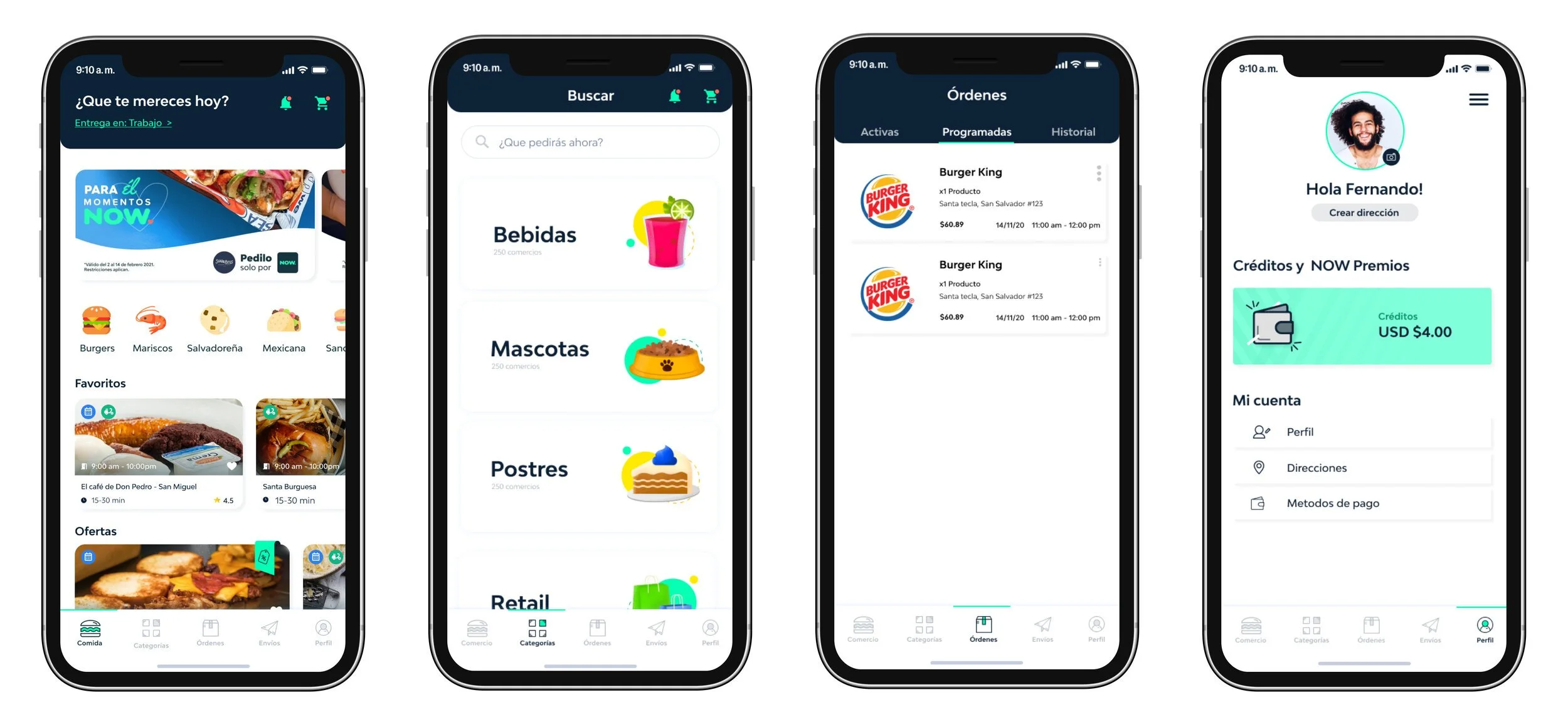
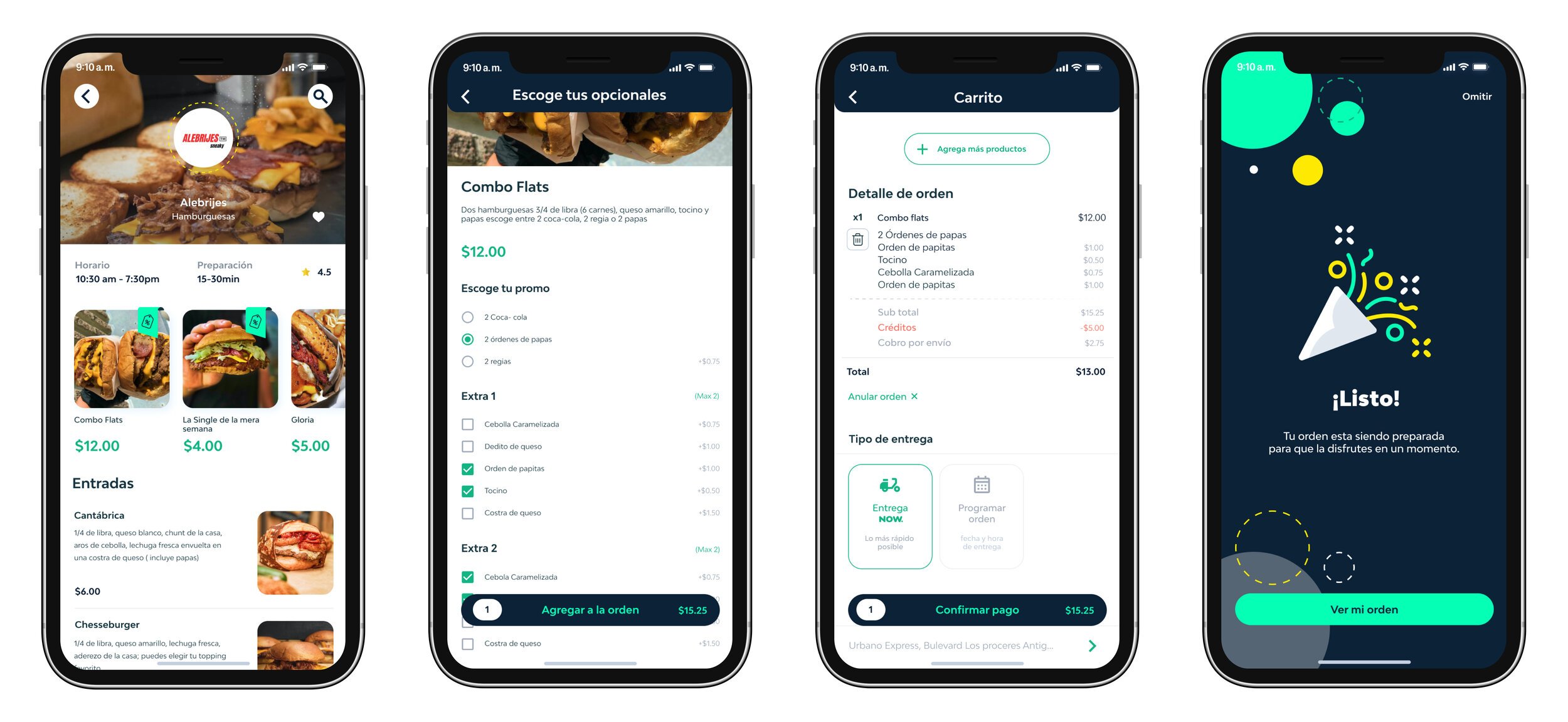
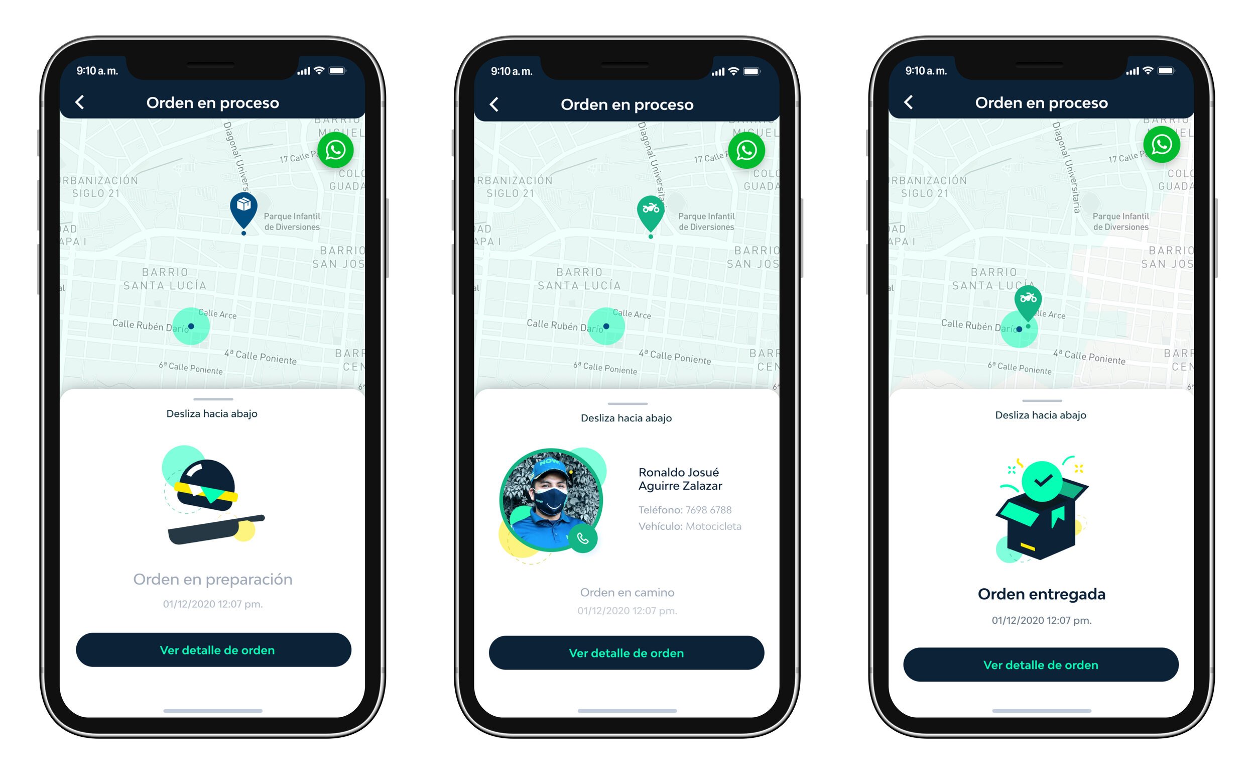
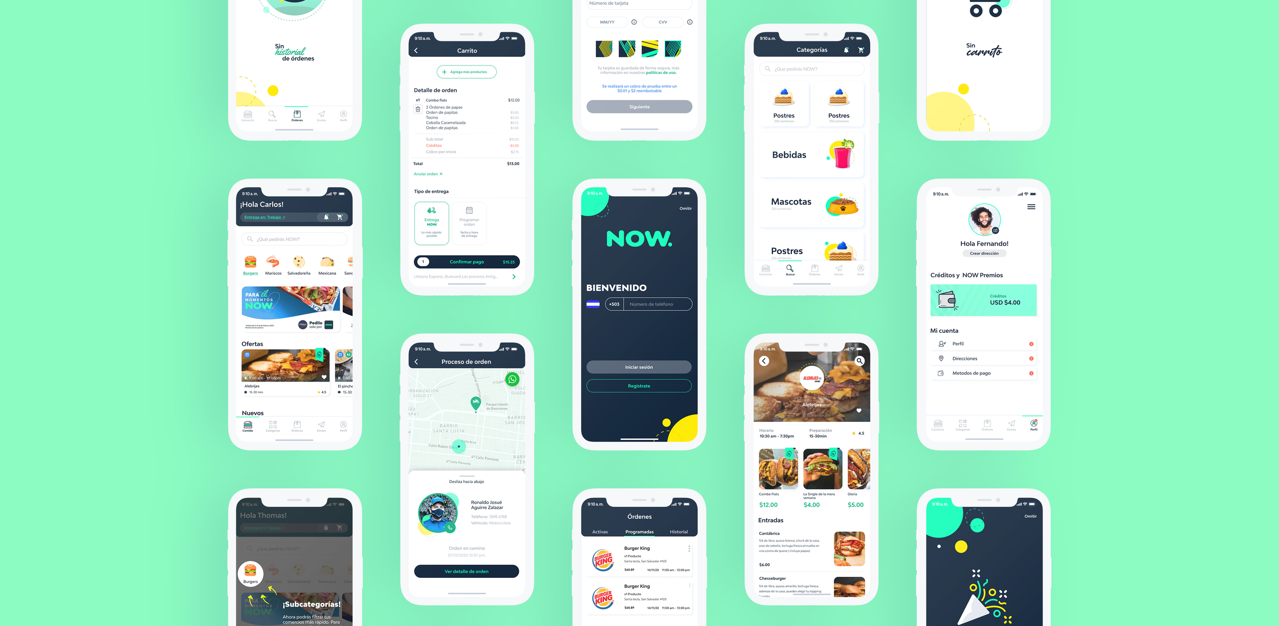
Once the app's structure was in place, I led the design team in bringing NOW to life—infusing simplicity with personality. We kept the experience clean and modern, relying on a white-dominant interface balanced by vibrant accent colors that reflected the brand’s energy. I collaborated closely with our illustrators to define a playful, cohesive illustration style—anchored in soft, rounded shapes that echoed the curves of our logo and unified the system visually.
R E S U L T S
10% increase in downloads
FTBs increased by 30% (most of them switchers from other apps)
NPS climbed from 3.2 (neutral) to 4.0 (promoter),
Seamlessly working app across multiple devices.