
Stubhub Visual Identity Refresh
StubHub, the 18th largest e-commerce company in the world, had gone through three brand refreshes in 2018, leading to poor brand recognition.
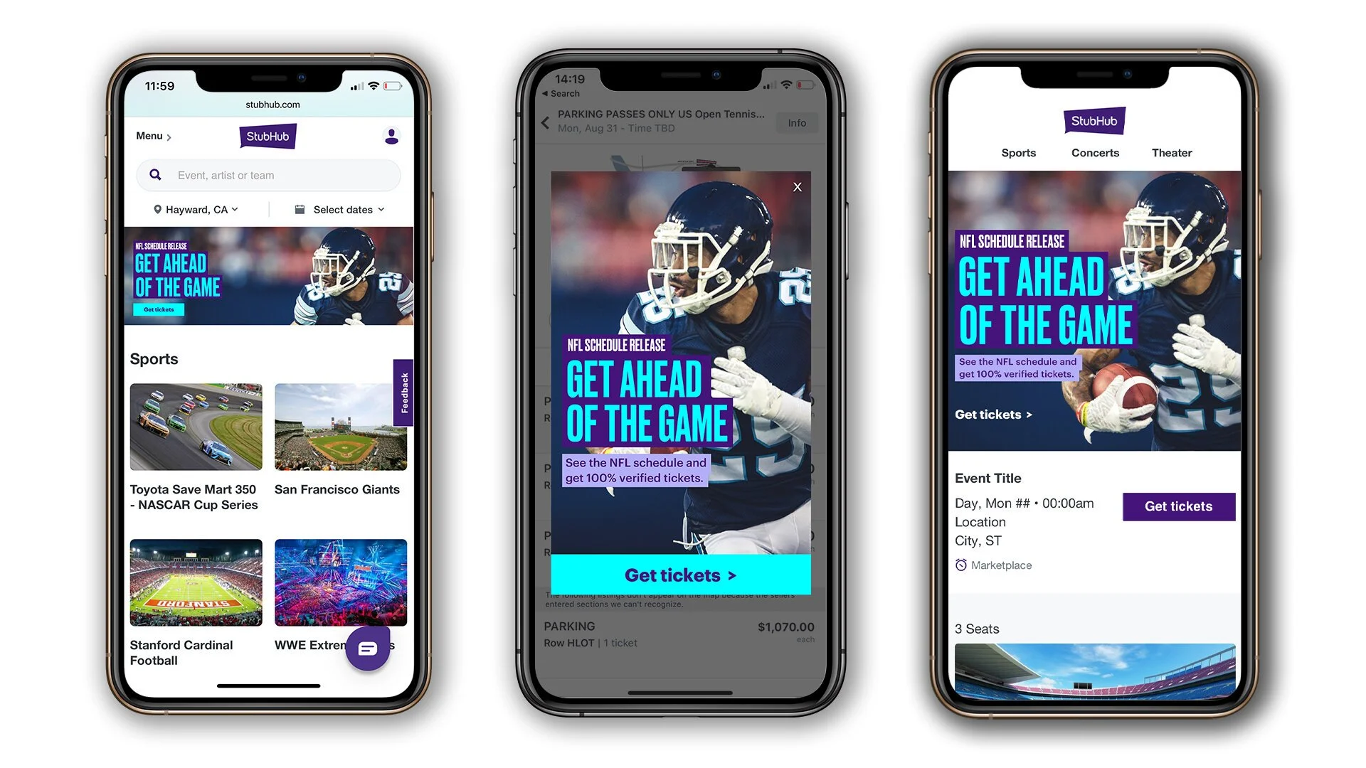
As an in-house agency, we were tasked with rebuilding the visual design system for the brand. I helped define the creative strategy and visual language, focusing on two core challenges: creating a flexible system that could scale across channels and building a more intimate, authentic experience for fans globally.
I led the conceptualization phase, helping define the creative thread that would unify the system across channels. I translated that direction into the CRM experience, establishing how the visual identity could flex across different asset types while maintaining consistency. As CRM Lead, I also partnered with the Creative Director to define and implement the visual system across the channel.
A R T D I R E C T O R / H E A D O F C R M D E S I G N



D E S I G N A P P R O A C H
We took the main pillars for our brand and we got to work. We took the photography style and shifted from stock and studio shot photography, to real, authentic ‘in the moment’ photography.
1.
For typography and color palette we took our current type and color and modernized and expanded for legibility and contrast to an evolved color palette and typography.
2.
We also developed graphic elements that would make the rebrand feel true to StubHub. We created a barring system and fractal element based from the logo to bring the rebrand together.
3.
R E S U L T S